PopupEntry
PopupEntry is a control that allows you to enter text with the IME when you click on Entry.
Overview
PopupEntry control has exactly the same usage as the Entry.
However, in the case of a regular Entry in a circular screen, the input text gets hidden behind the IME at the time of input.
The PopupEntry allows the input to be on a pop up, hence the written text is visible.
The following images shows a screen with a normal Entry and a screen with the text on the IME when you click on Entry.
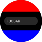
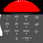
The Entry is not visible because it is masked by the IME.
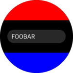
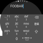
The above image is the same as using PopupEntry, It can type text while watching it properly.
When PopupEntry is used:
- The
BackgroundColorof the input pop up is the same as theBackgroundColorof thePopupEntry. The default color of thePopupEntryis set if you don't set theBackgroundColor. - The
TextColorinside the input pop up is also the same as theTextColorof thePopupEntry. - The IsPassword property of the input pop up is also the same as the
PopupEntry.
WARNING: If you set the PopupEntry width under the specific size(e.g 280), the PopupEntry can be truncated follow to device native theme.
How to use
PopupEntry uses the same method as the Entry.
<?xml version="1.0" encoding="utf-8" ?>
<ContentPage xmlns="http://xamarin.com/schemas/2014/forms"
             xmlns:x="http://schemas.microsoft.com/winfx/2009/xaml"
             xmlns:w="clr-namespace:Tizen.Wearable.CircularUI.Forms;assembly=Tizen.Wearable.CircularUI.Forms"
             x:Class="WearableUIGallery.TC.TCPopupEntry">
    <ContentPage.Content>
        <StackLayout Padding="20,40,20,40">
            <w:PopupEntry
                BackgroundColor="Gray"
                HorizontalOptions="FillAndExpand"
                TextColor="Blue"
                VerticalOptions="CenterAndExpand" />
            <w:PopupEntry
                HorizontalOptions="FillAndExpand"
                Placeholder="Foobar"
                VerticalOptions="CenterAndExpand" />
            <w:PopupEntry
                HorizontalOptions="FillAndExpand"
                IsPassword="True"
                Placeholder="Password"
                VerticalOptions="CenterAndExpand" />
        </StackLayout>
    </ContentPage.Content>
</ContentPage>