CircleListView
CircleListView is a view for presenting lists of data, a short list that does not require scrolling, and a long list that requires scrolling.
This view is an extension of Xamarin.Forms.ListView.
You can move the list using Bezel Interactions and Drag.
 |
 |
 |
|---|---|---|
| Normal list | Group list | 2 texts and 1 icon list |
Components
- Header : Text or view that is displayed at the beginning of a list.
- Cells : Data in a
CircleListViewis presented in cells. Each cell corresponds to a row of data. - Footer : Text or view that is displayed at end of a list.
Create CircleListView
Basically CircleListView looks same as Xamarin.Forms.ListView.
The difference from Xamarin.Forms.ListView is to provide an additional property for Tizen wearable such as BarColor
CircleListView has the following property:
- BarColor: This property gets or sets a scroll bar color value.
You can either set the Header and/or Footer with the simple text or with a more complex layout. Using HeaderTemplate and FooterTemplate properties, you can create more complex layouts for the header and footer including data binding.
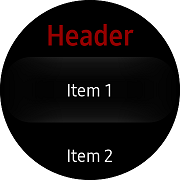
The following example has cells, header, footer.
And use the DataTemplate to format a data object for display.
WARNING: The CircleListView's backend which is EFL extension, has a limitation not being focused and not being tapped on the top and bottom of the screen in Wearable Circle devices. If each item of a list has too small or too high a height, the first or last item of a list cannot be focused and tapped. To avoid this inherent problem, you should specify a proper height value (120 recommended) by the ViewCell or ListView Header or Footer.
For more information, see the following links:
The code example of this guide uses TCCircleListView code of WearableUIGallery. The code is available in test\WearableUIGallery\WearableUIGallery\TC\TCCircleListView.xaml
The following code shows how to use CircleListView:
XAML file
<?xml version="1.0" encoding="utf-8" ?>
<ContentPage
    x:Class="WearableUIGallery.TC.TCCircleListView"
    xmlns="http://xamarin.com/schemas/2014/forms"
    xmlns:x="http://schemas.microsoft.com/winfx/2009/xaml"
    xmlns:sys="clr-namespace:System;assembly=netstandard"
    xmlns:w="clr-namespace:Tizen.Wearable.CircularUI.Forms;assembly=Tizen.Wearable.CircularUI.Forms">
    <ContentPage.Content>
        <w:CircleListView x:Name="mylist" RowHeight="360" ItemTapped="OnItemTapped">
            <w:CircleListView.ItemsSource>
                <x:Array x:Key="array" Type="{x:Type sys:String}">
                    <x:String>Item 1</x:String>
                    <x:String>Item 2</x:String>
                    <x:String>Item 3</x:String>
                    <x:String>Item 4</x:String>
                    <x:String>Item 5</x:String>
                    <x:String>Item 6</x:String>
                    <x:String>Item 7</x:String>
                    <x:String>Item 8</x:String>
                    <x:String>Item 9</x:String>
                    <x:String>Item 10</x:String>
                    <x:String>Item 11</x:String>
                    <x:String>Item 12</x:String>
                </x:Array>
            </w:CircleListView.ItemsSource>
            <w:CircleListView.Header>
                <x:String>Header</x:String>
            </w:CircleListView.Header>
            <w:CircleListView.Footer>
                <x:String>Footer</x:String>
            </w:CircleListView.Footer>
            <w:CircleListView.ItemTemplate>
                <DataTemplate>
                    <ViewCell>
                        <Label Text="{Binding .}"
                               VerticalOptions="Center"
                               HorizontalOptions="Center"
                               VerticalTextAlignment="Center"
                               HorizontalTextAlignment="Center"/>
                    </ViewCell>
                </DataTemplate>
            </w:CircleListView.ItemTemplate>
            <w:CircleListView.HeaderTemplate>
                <DataTemplate>
                    <Label
                        FontAttributes="Bold"
                        FontSize="Large"
                        HorizontalTextAlignment="Center"
                        Text="{Binding .}"
                        TextColor="Red" />
                </DataTemplate>
            </w:CircleListView.HeaderTemplate>
            <w:CircleListView.FooterTemplate>
                <DataTemplate>
                    <Label
                        FontAttributes="Bold"
                        FontSize="Large"
                        HorizontalTextAlignment="Center"
                        Text="{Binding .}"
                        TextColor="Blue" />
                </DataTemplate>
            </w:CircleListView.FooterTemplate>
        </w:CircleListView>
    </ContentPage.Content>
</ContentPage>
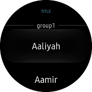
Add Group List as list contents
You can add group list as contents of CircleListView.
To enable grouping:
- Create a list of List<>.
- Set ItemsSource to that list.
- Set IsGroupingEnabled to true.
- Set GroupDisplayBinding to bind to the property of the groups that is being used as the title of the group.
The code example of this guide uses TCGroupList code of WearableUIGallery. The code is available in test\WearableUIGallery\WearableUIGallery\TC\TCGroupList.xaml
C# file
namespace WearableUIGallery.TC
{
    ...
    public class GroupModel : List<NamedList<string>>
    {
        public GroupModel()
        {
            Add(new NamedList<string>("group1") { "Aaliyah", "Aamir", "Aaralyn ", "Aaron", "Abagail", "Babitha", "Bahuratna", "Bandana", "Bulbul", "Cade", "Caldwell" });
            Add(new NamedList<string>("group2") { "Chandan", "Caster", "Dagan ", "Daulat", "Dag", "Earl", "Ebenzer", "Ellison", "Elizabeth", "Filbert", "Fitzpatrick", "Florian", "Fulton" });
            Add(new NamedList<string>("group3") { "Frazer", "Gabriel", "Gage", "Galen", "Garland", "Gauhar", "Hadden", "Hafiz", "Hakon", "Haleem", "Hank", "Hanuman" });
            Add(new NamedList<string>("group4") { "Jabali ", "Jaimini", "Jayadev", "Jake", "Jayatsena", "Jonathan", "Kamaal", "Jeirk", "Jasper", "Jack", "Mac", "Macy", "Marlon", "Milson" });
        }
    }

    public class NamedList<T> : List<T>
    {
        public NamedList(string name) => Name = name;
        public string Name { get; set; }
    }}
XAML file
<?xml version="1.0" encoding="utf-8" ?>
<ContentPage
    x:Class="WearableUIGallery.TC.TCGroupList"
    xmlns="http://xamarin.com/schemas/2014/forms"
    xmlns:x="http://schemas.microsoft.com/winfx/2009/xaml"
    xmlns:local="clr-namespace:WearableUIGallery.TC"
    xmlns:w="clr-namespace:Tizen.Wearable.CircularUI.Forms;assembly=Tizen.Wearable.CircularUI.Forms">
    <ContentPage.BindingContext>
        <local:GroupModel />
    </ContentPage.BindingContext>
    <ContentPage.Content>
        <w:CircleListView
            x:Name="mylist"
            GroupDisplayBinding="{Binding Name}"
            IsGroupingEnabled="True"
            ItemsSource="{Binding .}">
            <w:CircleListView.Header>
                <x:String>TITLE</x:String>
            </w:CircleListView.Header>
            <w:CircleListView.HeaderTemplate>
                <DataTemplate>
                    <Label
                        FontAttributes="Bold"
                        FontSize="10"
                        HeightRequest="120"
                        HorizontalTextAlignment="Center"
                        Text="{Binding .}"
                        TextColor="#6CC3F1" />
                </DataTemplate>
            </w:CircleListView.HeaderTemplate>
        </w:CircleListView>
    </ContentPage.Content>
</ContentPage>
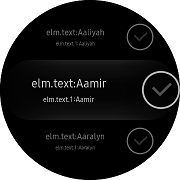
Add a list with 2 texts and 1 icon as list contents
You can add a list with two texts and one icon as contents of CircleListView.
This can easily be done using ViewCell.
It is nested inside a DataTemplate, which is inside CircleListView.ItemTemplate. The Layout of ViewCell is managed by a StackLayout. You can place it in the StackLayout with your desired configuration.
The code example of this guide uses XUIComponent's CircleList of Style2text1icon1 code. The code is available in sample\XUIComponents\UIComponents\UIComponents\Samples\CircleList/ListViewModel.cs and Style2text1icon1.xaml
C# file
namespace WearableUIGallery.TC
{
    public class ListViewModel : INotifyPropertyChanged
    {
        static List<string> _names = new List<string>
        {
            "Aaliyah", "Aamir", "Aaralyn", "Aaron", "Abagail",
            "Babitha", "Bahuratna", "Bandana", "Bulbul", "Cade", "Caldwell",
            "Chandan", "Caster", "Dagan ", "Daulat", "Dag", "Earl", "Ebenzer",
            "Ellison", "Elizabeth", "Filbert", "Fitzpatrick", "Florian", "Fulton",
            "Frazer", "Gabriel", "Gage", "Galen", "Garland", "Gauhar", "Hadden",
            "Hafiz", "Hakon", "Haleem", "Hank", "Hanuman", "Jabali ", "Jaimini",
            "Jayadev", "Jake", "Jayatsena", "Jonathan", "Kamaal", "Jeirk",
            "Jasper", "Jack", "Mac", "Macy", "Marlon", "Milson"
        };
...
        public List<string> Names => _names;
        public ObservableCollection<CheckableName> CheckableNames { get; private set; }

        public int CheckedNamesCount
        {
            get => _checkedNamesCount;
            private set
            {
                if (_checkedNamesCount != value)
                {
                    _checkedNamesCount = value;
                    OnPropertyChanged();

                    UpdateSelectOptionMessage();
                }
            }
        }

        public ListViewModel()
        {
            CheckableNames = new ObservableCollection<CheckableName>();
            foreach (var name in _names)
            {
                var data = new CheckableName(name, false);
                data.PropertyChanged += (s, e) =>
                {
                    if (e.PropertyName == "Checked")
                    {
                        CheckedNamesCount += data.Checked ? 1 : -1;
                    }
                };
                CheckableNames.Add(data);
            }
...
        }
   }

    public class CheckableName : INotifyPropertyChanged
    {
        string _name;
        bool _checked;

        public CheckableName(string name, bool isChecked)
        {
            _name = name;
            _checked = isChecked;
        }

        public event PropertyChangedEventHandler PropertyChanged;

        public string Name
        {
            get => _name;
            set
            {
                if (_name != value)
                {
                    _name = value;
                    OnPropertyChanged();
                }
            }
        }
        public bool Checked
        {
            get => _checked;
            set
            {
                if (_checked != value)
                {
                    _checked = value;
                    OnPropertyChanged();
                }
            }
        }
...
    }
XAML file
<ContentPage
    x:Class="UIComponents.Samples.CircleList.Style2text1icon1"
    xmlns="http://xamarin.com/schemas/2014/forms"
    xmlns:x="http://schemas.microsoft.com/winfx/2009/xaml"
    xmlns:local="clr-namespace:UIComponents.Samples.CircleList"
    xmlns:sys="clr-namespace:System;assembly=netstandard"
    xmlns:w="clr-namespace:Tizen.Wearable.CircularUI.Forms;assembly=Tizen.Wearable.CircularUI.Forms">
    <ContentPage.BindingContext>
        <local:ListViewModel />
    </ContentPage.BindingContext>
    <ContentPage.Content>
        <w:CircleListView
            x:Name="mylist"
            HasUnevenRows="True"
            ItemsSource="{Binding Names}">
            <w:CircleListView.ItemTemplate>
                <DataTemplate>
                    <ViewCell>
                        <StackLayout
                            HeightRequest="120"
                            HorizontalOptions="FillAndExpand"
                            Orientation="Horizontal"
                            VerticalOptions="FillAndExpand"
                            WidthRequest="360">
                            <StackLayout
                                HorizontalOptions="CenterAndExpand"
                                Orientation="Vertical"
                                VerticalOptions="Center">
                                <Label
                                    FontSize="8"
                                    HorizontalOptions="Center"
                                    HorizontalTextAlignment="Center"
                                    Text="{Binding ., StringFormat='elm.text:{0}'}"
                                    VerticalOptions="Center"
                                    VerticalTextAlignment="Center" />
                                <Label
                                    FontSize="5"
                                    HorizontalOptions="Center"
                                    HorizontalTextAlignment="Center"
                                    Text="{Binding ., StringFormat='elm.text.1:{0}'}"
                                    VerticalOptions="Center"
                                    VerticalTextAlignment="Center" />
                            </StackLayout>
                            <w:Check
                                DisplayStyle="Default"
                                HorizontalOptions="End"
                                VerticalOptions="Center" />
                        </StackLayout>
                    </ViewCell>
                </DataTemplate>
            </w:CircleListView.ItemTemplate>
        </w:CircleListView>
    </ContentPage.Content>
</ContentPage>