CircleScrollView
CircleScrollView is to ensure that larger views display well on smaller wearable devices.
It is an extension of Xamarin.Forms.ScrollView.
 |
 |
|---|---|
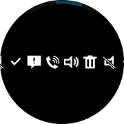
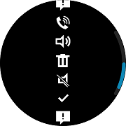
| Horizontal | Vertical |
Create CircleScrollView
Basically CircleScrollView looks same as Xamarin.Forms.ScrollView, scrolling is also possible with Bezel Interactions.
The difference from Xamarin.Forms.ScrollView is to provide some additional property for Tizen wearable such as BarColor
CircleScrollView has the following property:
- BarColor: This property gets or sets a scroll bar color value.
The following XAML code shows how to use CircleScrollView.
The direction of the scroller depends on the setting of the Orientation value.
In the following example, the Orientation of the CircleScrollView is set to Vertical. CircleScrollView is placed in the StackLayout to contain many images, and its BarColor is "Red".
For more information, see the following links:
- CircleScrollView API reference
- Xamarin.Forms.ScrollView API reference
- Xamarin.Forms.ScrollView Guide
The code example of this guide uses HorizontalScroller.xaml code of XUIComponent. The code is available in sample\XUIComponents\UIComponents\UIComponents\Samples\CircleScroller/HorizontalScroller.xaml
The following code shows how to use CircleScrollView:
XAML file
<ContentPage
    x:Class="UIComponents.Samples.CircleScroller.VerticalScroller"
    xmlns="http://xamarin.com/schemas/2014/forms"
    xmlns:x="http://schemas.microsoft.com/winfx/2009/xaml"
    xmlns:local="clr-namespace:UIComponents.Samples.CircleScroller"
    xmlns:sys="clr-namespace:System;assembly=netstandard"
    xmlns:w="clr-namespace:Tizen.Wearable.CircularUI.Forms;assembly=Tizen.Wearable.CircularUI.Forms">
    <ContentPage.Content>
        <w:CircleScrollView x:Name="myscroller" Orientation="Vertical" BarColor="Red">
            <StackLayout
                HorizontalOptions="FillAndExpand"
                Orientation="Vertical"
                VerticalOptions="FillAndExpand">
                <Image HorizontalOptions="CenterAndExpand" Source="tw_btn_delete_holo_dark.png" />
                <Image HorizontalOptions="CenterAndExpand" Source="tw_number_controller_icon_ringtone_mute.png" />
                <Image HorizontalOptions="CenterAndExpand" Source="tw_ic_popup_btn_check.png" />
                <Image HorizontalOptions="CenterAndExpand" Source="tw_number_controller_icon_alert.png" />
                <Image HorizontalOptions="CenterAndExpand" Source="tw_number_controller_icon_bell.png" />
                <Image HorizontalOptions="CenterAndExpand" Source="tw_number_controller_icon_ringtone_sound.png" />
            </StackLayout>
        </w:CircleScrollView>
    </ContentPage.Content>
</ContentPage>