CirclePage
Warning
CirclePage is obsolete as of version 1.5.0.
Please use Xamarin.Forms.ContentPage instead.
- CirclePage →
Xamarin.Forms.ContentPage- ActionButton →
Xamarin.Forms.Button+Xamarin.Forms.Button.Style(TizenSpecific) orContentButton - RotaryFocusObject →
BezelInteractionPageorXamarin.Forms.Application.ActiveBezelInteractionElement(TizenSpecific) - CircleSurfaceItems →
CircleSurfaceView.CircleSurfaceItems - CircleToolbarItems →
Xamarin.Forms.Page.ToolbarItems
- ActionButton →
CirclePage, is a visual element, which is derived from Xamarin.Forms.Page. This occupies entire wearable screen.
Overview
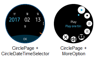
CirclePage is a container of any control that uses circle object or Rotary Event.
If you want to use any circle control or you want to handle the Rotary Event, you must use CirclePage.
CirclePage can set BOTTOM button (ActionButtonItem), CircleProgressBar, CircleSlider and MoreOption on its own.
WARNING: CircleListView, CircleDateTimeSelector, CircleScrollView, CircleStepper must be confined in the CirclePage container or Page with CircleSurfaceEffectBehavior. If you add these controls in any other way, it may cause an exception or cannot display the controls.
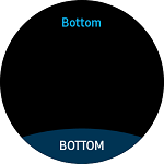
BOTTOM button (ActionButtonItem)
A semicircular button is shown at bottom of screen. See the following image:
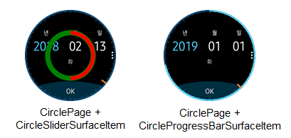
CircleProgressBar
CircleProgressBar displays the progress status of a given task with the circular design.
CircleSlider
CircleSlider changes value corresponding to the
Rotary Event. This displays a circle bar at the edge of the circle screen. You can change the radius of circle bar by modifying radius value.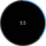
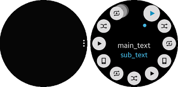
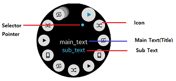
MoreOption
MoreOption contains a cue button (in the figure on the left). When the cue button is clicked, the rotary selector view opens from the cue location (in the figure on the right). The rotary selector arranges multiple items around the circular edge of the screen. The focus switches between items when you rotate the bezel.
Create CirclePage
To create CirclePage, you must download Tizen.Wearable.CircularUI NuGet package in your application project. For more information, see QuickStart.
- Add a new XAML page to the Tizen Xamarin.Forms application.
- Import Tizen.Wearable.CircularUI.Forms and change the base class from ContentPage to CirclePage.
- This must be done in both the C# and XAML.
In a XAML file, import CircularUI and define namespace as xmlns:w="clr-namespace:Tizen.Wearable.CircularUI.Forms;assembly=Tizen.Wearable.CircularUI.Forms"
The code example of this guide uses TCCirclePage code of WearableUIGallery. The code is available in test\WearableUIGallery\WearableUIGallery\TC\TCCirclePage.xaml
C# file
using Tizen.Wearable.CircularUI.Forms;
using Xamarin.Forms.Xaml;


namespace WearableUIGallery.TC
{
    [XamlCompilation(XamlCompilationOptions.Compile)]
    public partial class TCCirclePage : CirclePage
    {
        public TCCirclePage()
        {
            InitializeComponent();
        }
    }
}
XAML file
<?xml version="1.0" encoding="utf-8" ?>
<w:CirclePage
    x:Class="WearableUIGallery.TC.TCCirclePage"
    xmlns="http://xamarin.com/schemas/2014/forms"
    xmlns:x="http://schemas.microsoft.com/winfx/2009/xaml"
    xmlns:local="clr-namespace:WearableUIGallery.TC"
    xmlns:w="clr-namespace:Tizen.Wearable.CircularUI.Forms;assembly=Tizen.Wearable.CircularUI.Forms"
    RotaryFocusObject="{Binding RotaryFocusTarget}">
    <w:CirclePage.Content>
Add content in CirclePage
You can set content in the CirclePage.Content. In the XAML file, code explains that CirclePage adds content with CircleDateTimeSelector.
RotaryFocusObject property sets the currently focused control that is handled by rotating and display the circle object of the focused control.
If the value is not set properly, the control will not receive the Rotary Event.
For more information, see the following links:
XAML file
<w:CirclePage
    x:Class="WearableUIGallery.TC.TCCirclePage"
    xmlns="http://xamarin.com/schemas/2014/forms"
    xmlns:x="http://schemas.microsoft.com/winfx/2009/xaml"
    xmlns:local="clr-namespace:WearableUIGallery.TC"
    xmlns:w="clr-namespace:Tizen.Wearable.CircularUI.Forms;assembly=Tizen.Wearable.CircularUI.Forms"
    RotaryFocusObject="{Binding RotaryFocusTarget}">
    <w:CirclePage.BindingContext>
        <local:TCCirclePageViewModel RotaryFocusTarget="{x:Reference DateSelector}"/>
    </w:CirclePage.BindingContext>
    <w:CirclePage.Content>
        <StackLayout
            BackgroundColor="Black"
            HorizontalOptions="FillAndExpand"
            Orientation="Vertical"
            VerticalOptions="FillAndExpand">
            <w:CircleDateTimeSelector
                x:Name="DateSelector"
                IsVisibleOfDate="{Binding DateVisiblity}"
                MaximumDate="1/1/2020"
                MinimumDate="1/12/2015"
                ValueType="Date" />
        </StackLayout>
    </w:CirclePage.Content>
Add ActionButtonItem in CirclePage
The ActionButtonItem in CirclePage displays BOTTOM button. The ActionButtonItem is derives from Xamarin.Forms.Menuitem.
ActionButtonItem has the following properties:
Command: Gets or sets theICommandto be invoked on activation (item clicked).Text: Gets or sets text of button.
For more information, see the following links:
XAML file
    <w:CirclePage.ActionButton>
        <w:ActionButtonItem Command="{Binding ProgressBarVisibleCommand}" Text="OK" />
    </w:CirclePage.ActionButton>
Add ToolbarItems in CirclePage
CirclePage ToolbarItems set items of rotary selector views. You can set each item with CircleToolbarItem property.
CircleToolbarItem derives from Xamarin.Forms.ToolbarItem.
CircleToolbarItem has the following properties:
Command: Gets or sets theICommandto be invoked on activation (item clicked).Icon: Gets or sets image of item.Text: Gets or sets title of item.
For more information, see the following links:
XAML file
    <w:CirclePage.ToolbarItems>
        <w:CircleToolbarItem
            Command="{Binding Play.Action}"
            Icon="{Binding Play.Icon}"
            SubText="{Binding Play.SubText}"
            Text="{Binding Play.Text}" />
        <w:CircleToolbarItem
            Command="{Binding Stop.Action}"
            Icon="{Binding Stop.Icon}"
            SubText="{Binding Stop.SubText}"
            Text="{Binding Stop.Text}" />

    ...

    </w:CirclePage.ToolbarItems>
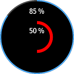
Add CircleProgressBarSurfaceItem in CirclePage
CirclePage CircleSurfaceItems can set CircleProgressBarSurfaceItem and CircleSliderSurfaceItem.
CircleProgressBarSurfaceItem represents Circle ProgressBar.
progress1 at XAML code represents the outer circle of following image. progress2 represents the inner circle.
If you use CircleProgressbar, you do not need to set the RotaryFocusObject property of CirclePage.
When Value property is increased or decreased, circle object extends or shrinks the following to the Value property.
CircleProgressBarSurfaceItem has the following properties:
Value: Gets or sets the value of the progress bar.IsVisible: Gets or sets the visibility value of circle surface item.BarRadius: Gets or sets the bar radius value.BackgroundRadius: Gets or sets the background radius value.BarLineWidth: Gets or sets the bar line width value.BackgroundLineWidth: Gets or sets the background line width value.BarColor: Gets or sets the bar color value.BackgroundColor: Gets or sets the background color value.
For more information, see the following links:
The code example of this guide uses CircleProgressBar.xaml code of XUIComponent. The code is available in sample\XUIComponents\UIComponents\UIComponents\Samples\CircleProgressBar.xaml
XAML file
<w:CirclePage
    x:Class="UIComponents.Samples.CircleProgressBar"
    xmlns="http://xamarin.com/schemas/2014/forms"
    xmlns:x="http://schemas.microsoft.com/winfx/2009/xaml"
    xmlns:local="clr-namespace:UIComponents.Samples"
    xmlns:sys="clr-namespace:System;assembly=netstandard"
    xmlns:w="clr-namespace:Tizen.Wearable.CircularUI.Forms;assembly=Tizen.Wearable.CircularUI.Forms"
    NavigationPage.HasNavigationBar="False">
    <w:CirclePage.BindingContext>
        <local:CircleProgressBarViewModel />
    </w:CirclePage.BindingContext>
    <w:CirclePage.Content>
        <StackLayout
            Padding="0,30,0,0"
            BackgroundColor="Black"
            HorizontalOptions="Center"
            Orientation="Vertical"
            VerticalOptions="FillAndExpand">
            <Label
                x:Name="label1"
                FontAttributes="Bold"
                FontSize="12"
                Text="{Binding ProgressLabel1}"
                TextColor="White" />
            <Label
                x:Name="label2"
                Margin="0,40"
                FontAttributes="Bold"
                FontSize="12"
                Text="{Binding ProgressLabel2}"
                TextColor="White" />
        </StackLayout>
    </w:CirclePage.Content>
    <w:CirclePage.CircleSurfaceItems>
        <w:CircleProgressBarSurfaceItem
            x:Name="progress1"
            IsVisible="True"
            Value="{Binding ProgressValue1}" />
        <w:CircleProgressBarSurfaceItem
            x:Name="progress2"
            BackgroundColor="Black"
            BackgroundLineWidth="15"
            BackgroundRadius="70"
            BarColor="Red"
            BarLineWidth="15"
            BarRadius="70"
            IsVisible="True"
            Value="{Binding ProgressValue2}" />
    </w:CirclePage.CircleSurfaceItems>
</w:CirclePage>
Add CircleSliderSurfaceItem in CirclePage
CircleSliderSurfaceItem represents Circle Slider.slider at XAML code represents the circle of following image.
If you use CircleSlider bar, you must set Circle Slider name at the RotaryFocusObject property of CirclePage.
The Value property is the default value for the Slider. If you rotate the bezel, the Value property increases or decreases depending on the bezel behavior.
The Increment property is the incremental or decremental change as you rotates the bezel.
CircleSliderSurfaceItem has the following properties:
Value: Gets or sets the value of the slider.Increment: The value of the slider is increased/decreased by the Increment value.Minimum: Gets or sets the minimum value of the slider.Maximum: Gets or sets the maximum value of the slider.BarLineWidth: Gets or sets the bar line width value.BackgroundLineWidth: Gets or sets the background line width value.BarColor: Gets or sets the bar color value.BackgroundColor: Gets or sets the background color value.
For more information, see the following links:
The code example of this guide uses CircleSlider.xaml code of XUIComponent. The code is available in sample\XUIComponents\UIComponents\UIComponents\Samples\CircleSlider.xaml
XAML file
<w:CirclePage
    x:Class="UIComponents.Samples.CircleSlider"
    xmlns="http://xamarin.com/schemas/2014/forms"
    xmlns:x="http://schemas.microsoft.com/winfx/2009/xaml"
    xmlns:local="clr-namespace:UIComponents.Samples"
    xmlns:sys="clr-namespace:System;assembly=netstandard"
    xmlns:w="clr-namespace:Tizen.Wearable.CircularUI.Forms;assembly=Tizen.Wearable.CircularUI.Forms"
    NavigationPage.HasNavigationBar="False"
    RotaryFocusObject="{x:Reference slider}">
    <w:CirclePage.Content>
        <StackLayout
            HorizontalOptions="Center"
            Orientation="Vertical"
            VerticalOptions="Center">
            <Label
                x:Name="label"
                BindingContext="{x:Reference Name=slider}"
                FontSize="12"
                Text="{Binding Value, StringFormat='{0:F1}'}" />
        </StackLayout>
    </w:CirclePage.Content>
    <w:CirclePage.CircleSurfaceItems>
        <w:CircleSliderSurfaceItem
            x:Name="slider"
            Increment="0.5"
            Maximum="15"
            Minimum="0"
            Value="3" />
    </w:CirclePage.CircleSurfaceItems>
</w:CirclePage>