Visualizing your algorithm's outputs
The run()function wrapping your code receives an output_directory where it can create all kinds of files. Usually, you only want to look at a few of those files, the rest being debug data. Visualizations help you declare pre-sets of relevant files.
Here is a simple example, assuming your code an image named output.jpg.
outputs:
    visualizations:
    - path: output.jpg
For now, to debug your visualizations, you have to commit and push your new qaboard.yaml.
We plan on letting you edit simply qaboard.yaml locally, and update the visualizations when you use qa --share.
You can provide multiple relevant files, and hide debug visualizations by default:
outputs:
    visualizations:
    - path: output.jpg
    - path: debug.jpg
      default_hidden: true
      # type: image/jpg # auto-guessed
Users will get switches to toggle debug visualizations:
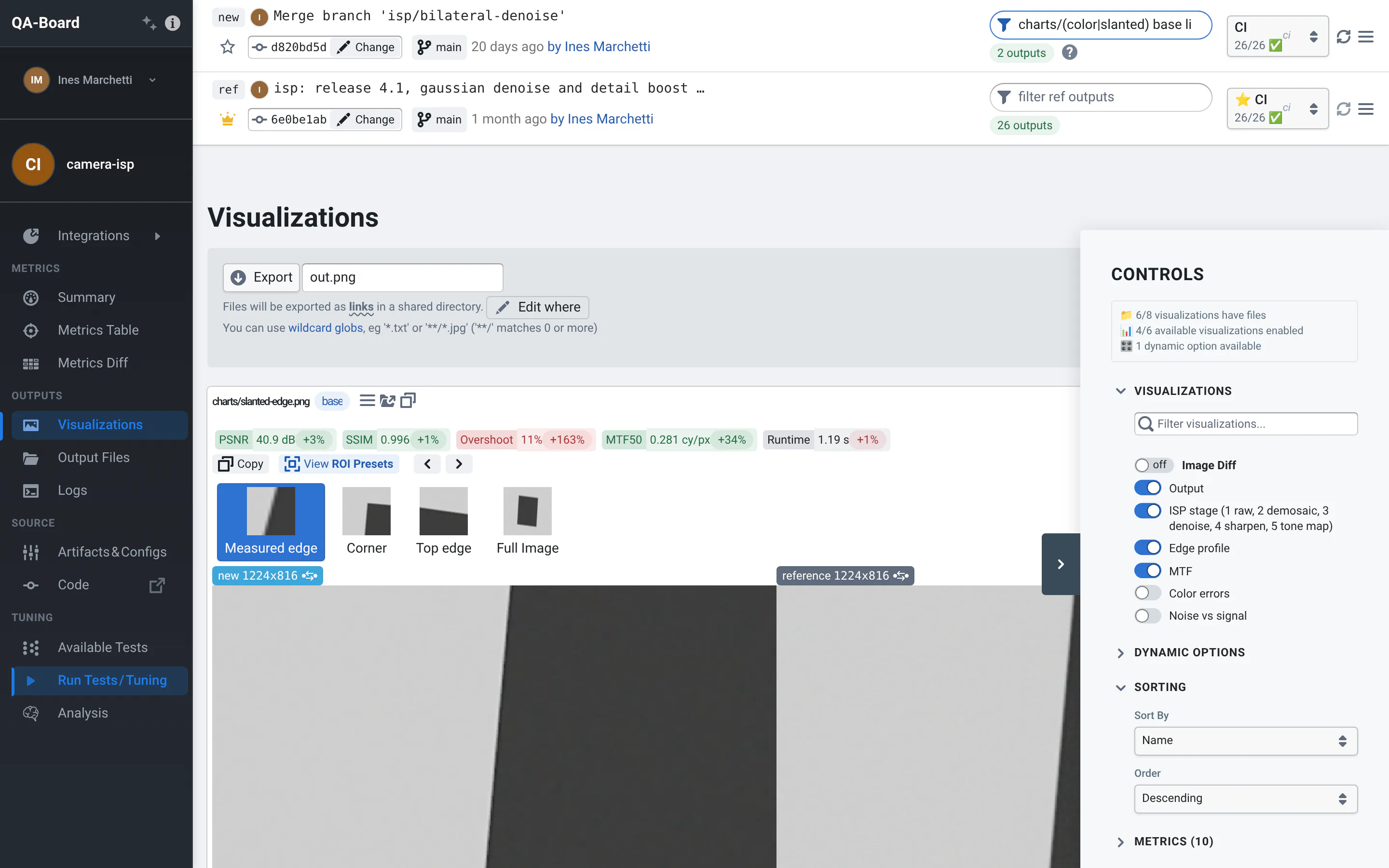
Available file viewers
QA-Board tries to guess the right image viewer depending on the file extension or a type
| Extensions | Type | Viewer |
|---|---|---|
*.jpg*, *.png*, *.bmp*, *.tif*, *.pdf*... | image/* | Image |
*.hex*, *.raw*, *.dng* | image/* | Image, if the server has a reader for these raw formats (not included) |
*.plotly.json, *.plotly.html | plotly/json / plotly/html | Plot.ly |
*.flame.json | flame/json | Flame Graph, diffable |
*.html | text/html | HTML (in a frame, scripts don't run) |
*.mp4, *.webm, *.mov, *.webp, *.gif | video/* | Video: synced, side by side, wipe or difference |
*.txt, unidentified | text/plain* | Text (diffs, with VSCode's Monaco Editor) |
</> | pointcloud/txt | ToF's pointcloud viewer (needs to be split) |
</> | 6dof/txt | SLAM's 6DoF viewer (needs to be split) |
Image viewer
- Supports all common image formats.
- Fast and smooth zoom & pan, synced. Fast image streaming via IIIF.
- Color tooltip, with a synced cursor on the other images.
- Perceptual color difference.
- Automatic regions of interest, found where images differ most according to a YIQ, SSIM or CIE (1976, 1994, 2000) color difference.
- Image filters (brightness, contrast, gamma, sharpen).
- Histograms per channel.
- Copy the new, reference or diff image to the clipboard. Press t to swap new and reference.
How to use it is described in the user guide: comparing images.
Images are served by an IIIF image server, tile by tile: the viewers only load what they show, even for images over 100 MP.
Draw your own debug information in the images you save, like detection boxes: the viewer compares them like any other image.
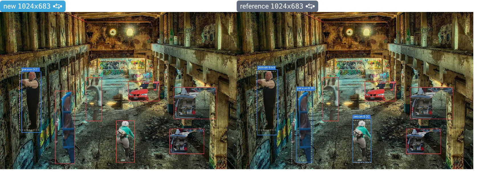
If a run saved both image.png and image.tiff, a visualization of image.png shows the TIFF. When the reference run doesn't have the file, the viewer falls back to the reference's .tiff, then .bmp, of the same name: it helps comparing results across a change of output format.
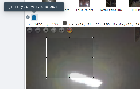
Regions of interest
The image viewer can thumbnails to navigate between Regions of Interest. To enable this, you must provide as input metadata some info. With YAML syntax:
width: 800   # optional, useful if your results are showed with downscaled resolution
height: 600  # optional, idem
roi:
- {x: 1408, y: 244, w: 121, h: 97, label: "Gradations and overshoots"}
- {x: 455, y: 651, w: 58, h: 58, label: "False colors"}
# you can override give the image dimension per ROI:
- {image_width: 1600, image_height: 1200, x: 351, y: 567, w: 45, h: 53, label: "Details fine line"}
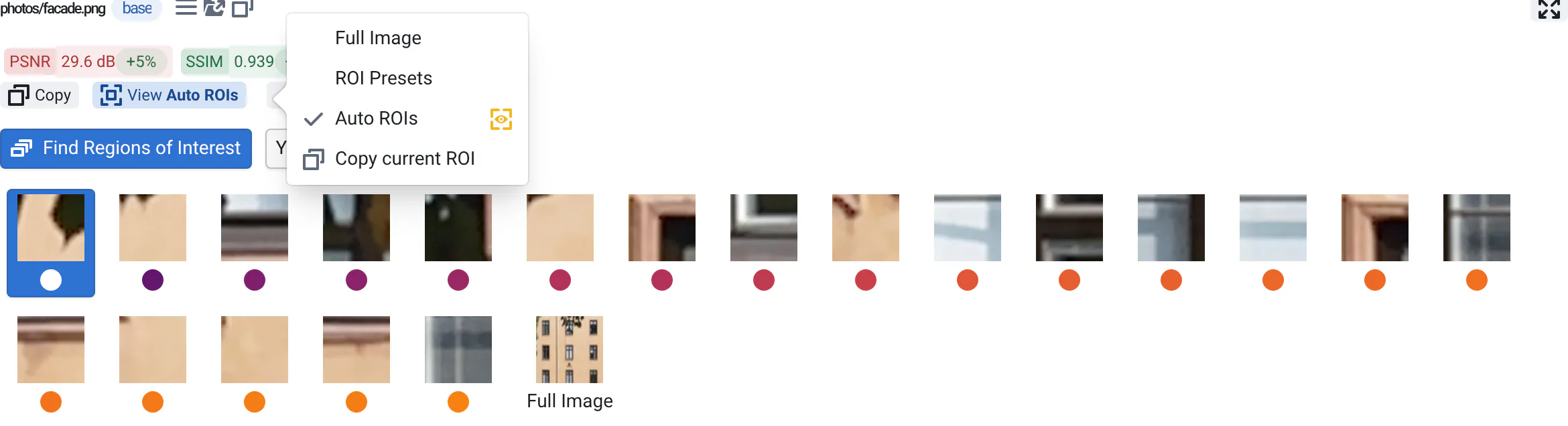
If you click on the histogram button, you'll be able to select a region of interest and easily copy the format above:
Plot.ly viewer
The Plotly library has everything you need from bar charts to 3d plots.
- huge variety of plots
- interactive plots
- easy-ish to use with binding to python/JS/matlab...
- web-based
- open-source and popular
- performant
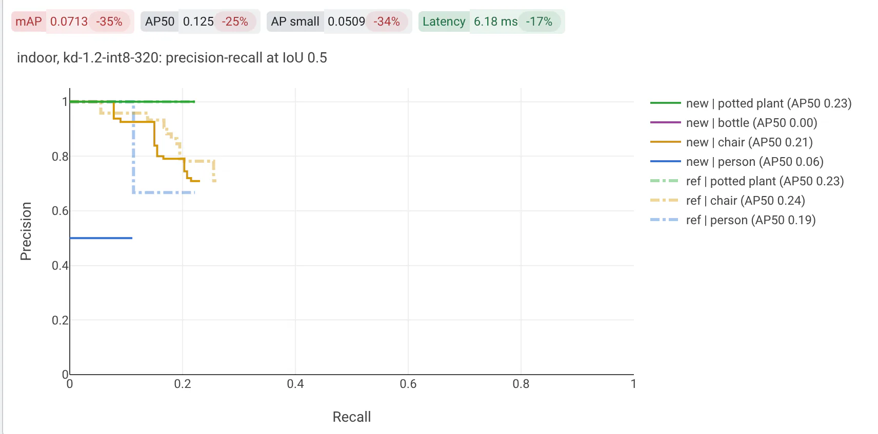
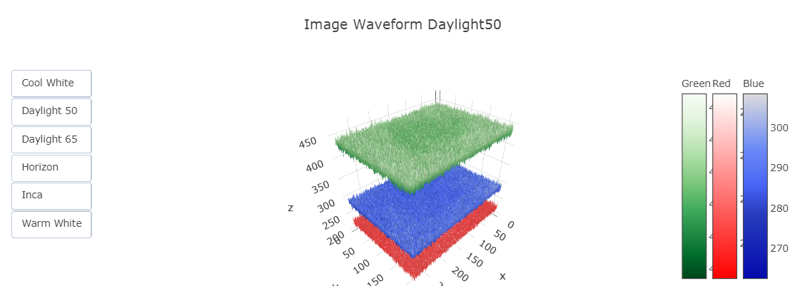
All you need is to save your plot data as JSON.
import plotly.graph_objects as go
fig = go.Figure(data=go.Bar(y=[2, 3, 1]))
with open('graph.plotly.json', 'w') as f:
  spec = fig.to_json() # '{"layout": {...}, "data": [{...}, {...}, ...]}'
  f.write(spec)
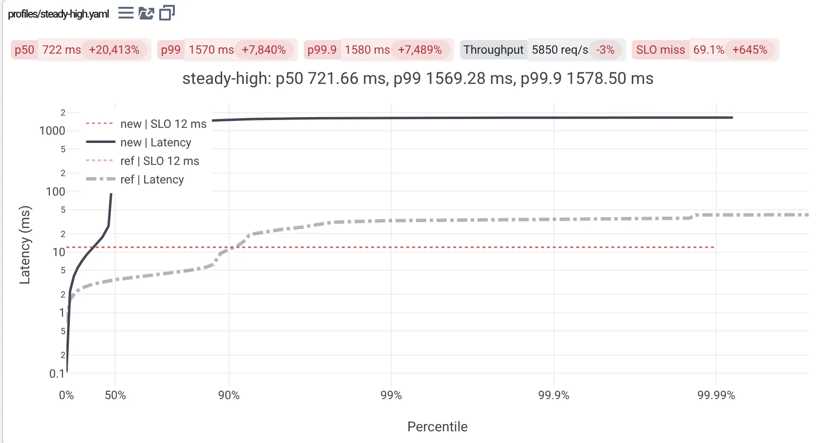
By default, the new and reference plots are shown side by side. With side_by_side: false, the reference run's traces are drawn on the same axes as the new run's (when your traces set their colors, the reference's are dashed and faded):
outputs:
  visualizations:
    - path: latency_cdf.plotly.json
      side_by_side: false
You can also save figures as stand-alone HTML, e.g. with fig.write_html('graph.plotly.html'). They are shown side by side (new and reference) in iframes, so the reference isn't overlaid on the same plot like with JSON.
Text Viewer
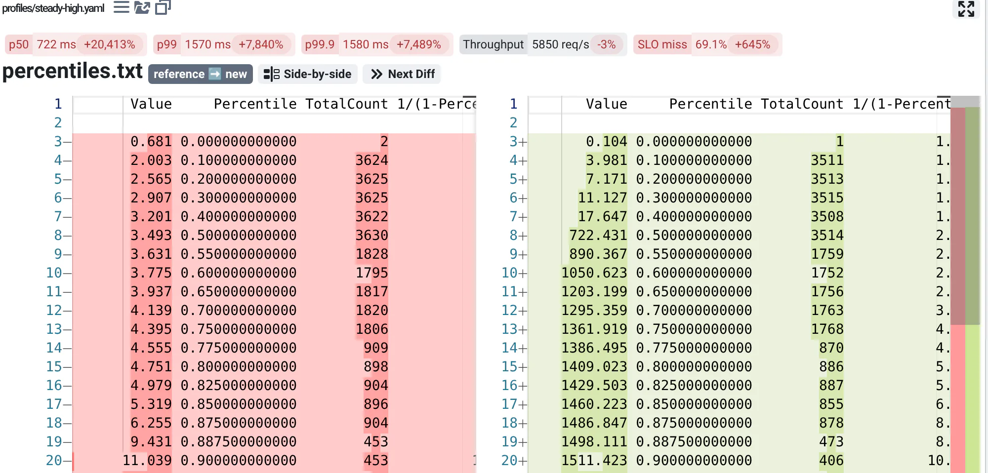
Text files are diffed with the reference's in the Monaco editor. Next Diff jumps to the next change, and t swaps the sides.
HTML
HTML files, like the reports your code renders, are shown one above the other: the new run's, then the reference's. Each shows in a frame of its own: images and links relative to the HTML file work, its styles don't change the page, and scripts don't run.
Flame Graphs
We love Brendan Gregg's flame charts and integrated Martin Spier's d3-flame-graph. At a glance, you can check where you code spends its CPU cycles, and use differential flame graphs to debug regressions.
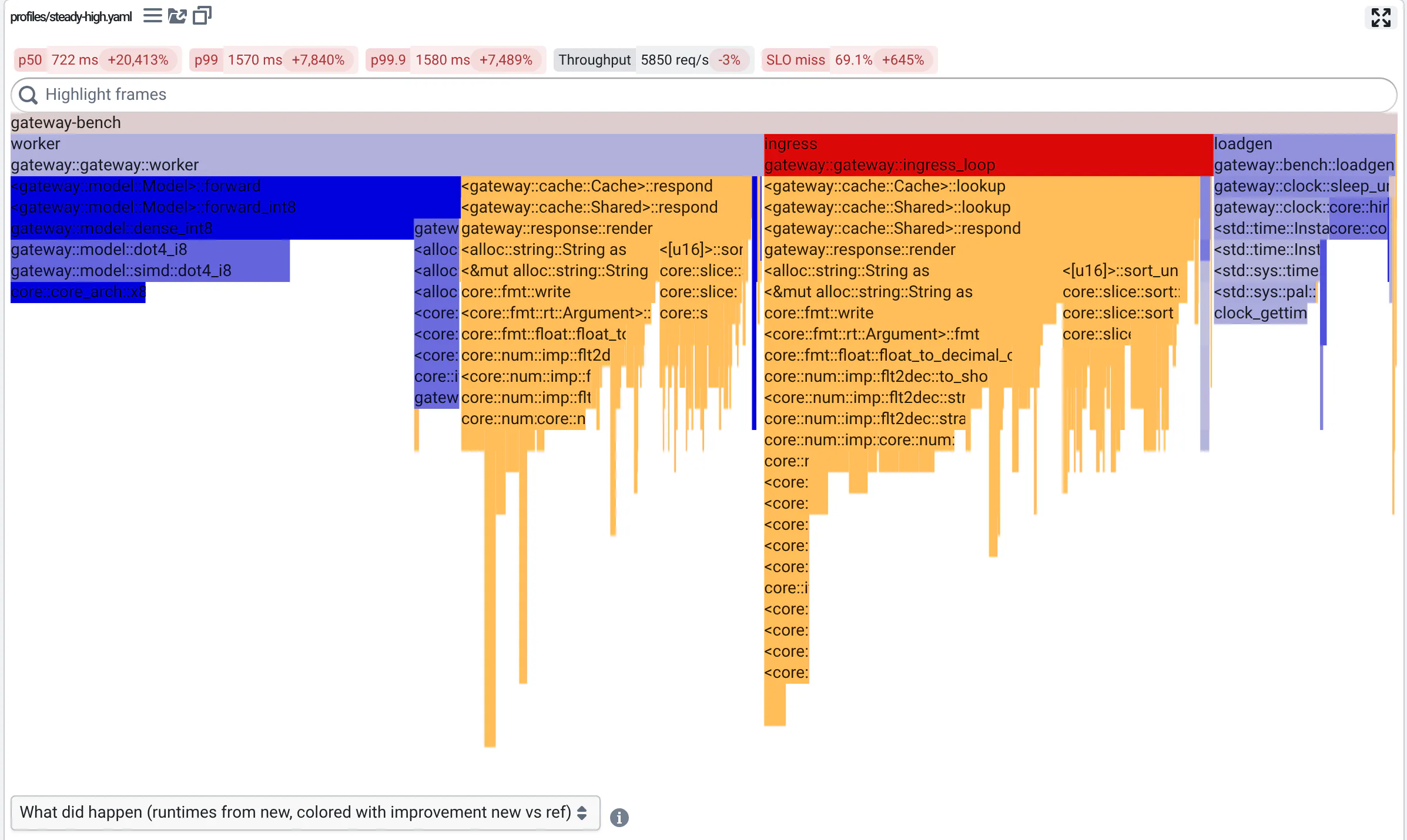
For a tutorial read our blog post.
Video viewer
- New and reference play in sync, frame by frame: paused, both show the same frame.
- Compare them side by side, with a wipe (drag the divider), by toggling between them (t), or as their difference (amplified up to ×64).
- Zoom with the mouse wheel or a pinch, drag to pan: both videos follow, even when their resolutions differ. Zoomed in, you see the actual pixels and their coordinates.
- Step frame by frame, scrub, slow down to 0.1×, loop.
- Copy or save the current frame as a PNG.
How to use it is described in the user guide: comparing videos.
Browsers play H.264, VP9 and AV1 videos, in .mp4 or .webm files. Other codecs (e.g. HEVC/H.265, MPEG-4 part 2) or containers (e.g. .avi) show an error: convert them when your code writes them, for instance with:
ffmpeg -i input.avi -c:v libx264 -pix_fmt yuv420p -movflags +faststart output.mp4
+faststart lets a video start playing before it's fully downloaded. Animated .webp and .gif files are compared the same way, but your browser plays them on its own: they are not synced.
QA-Board finds a video's frame rate when it plays, or when you step through its frames. If it guesses wrong, e.g. for variable frame rates, set it, with an optional image shown before the video loads:
outputs:
  visualizations:
  - path: camera.mp4
    fps: 30
    poster: camera.jpg  # default: poster.jpg, if the run created it
Point clouds and trajectories
Point clouds open in a 3D viewer, and 6DoF trajectories are drawn against the ground truth when the run has one.
More Viewers?
Tell us what you need! The next we'll implement is likely vega specs. It would notably allow us to display altair visualizations. We could also have a minimal integration with notebooks, visdom, webiz...
You can also write your own viewer: viewers are React components that download a run's files and display them. They live in webapp/src/viewers, and OutputViewer.jsx picks one for each visualization type. Start from an existing viewer, and run the web app's dev server as described in its README. Contributions are welcome!
Dynamic visualizations
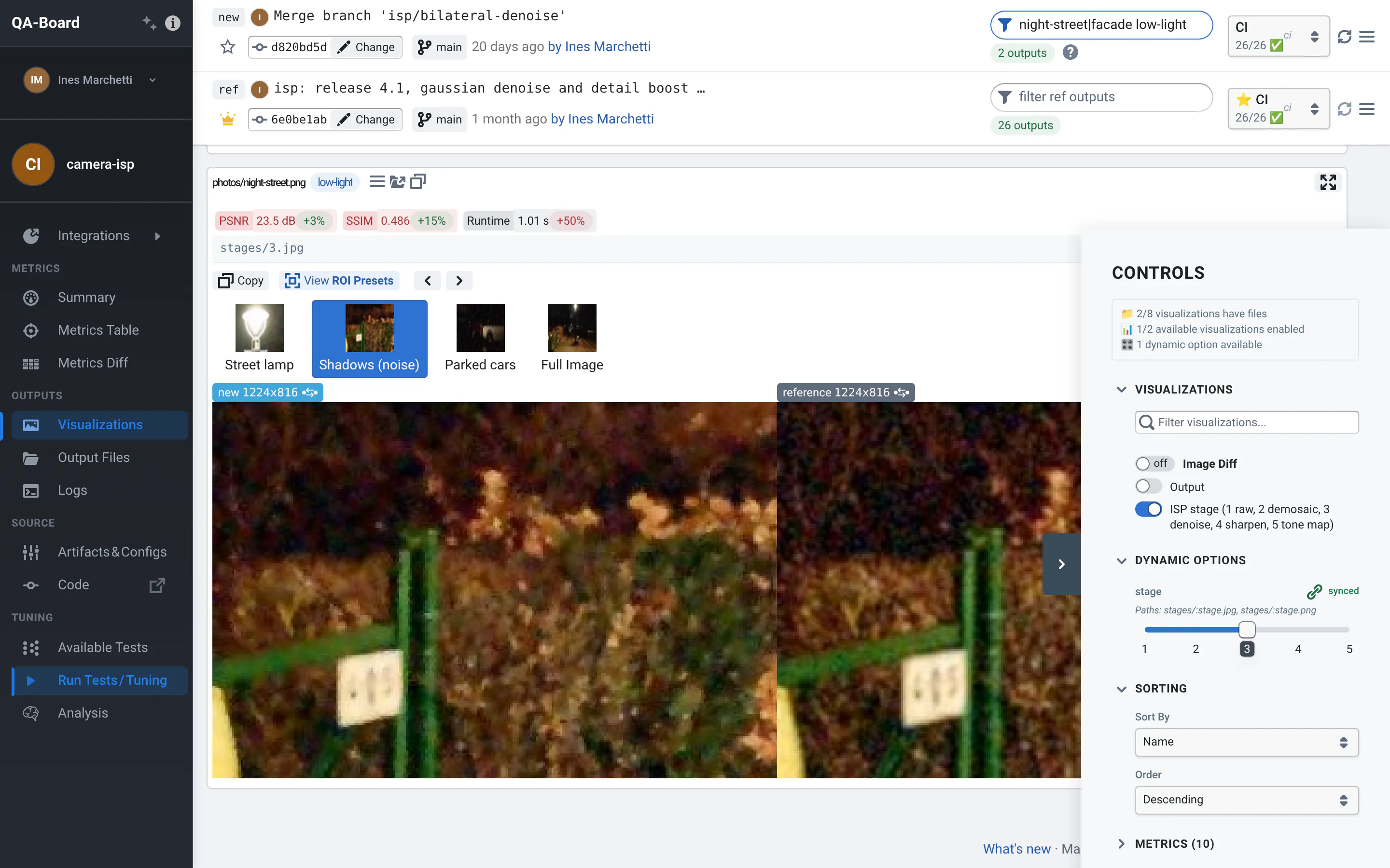
You can use a special syntax to create dynamic visualizations at display-time. Users will be able to choose what to display using sliders / select options:
outputs:
    visualizations:
    - name: Movie Frames
      # you can use the `/user/:name` syntax to match part of filenames
      path: ":frame/output.jpg"
      # you can match part of filenames (experimental)
      path: ":frame/frame_:number.jpg"

      # For more examples, the full syntax is available at:
      # https://github.com/pillarjs/path-to-regexp
      # Note that for the most advanced syntax you need to escape strings like this
      # path: frames/:frame(\\d+).jpg
You can also use regular expressions (inside parentheses!) to match which output files you want to view:
outputs:
    visualizations:
      # A common use case is matching file extensions
      path: "(.*\.jpg)"
      # ... or parts of filenames
      path: "(debug_.*\.jpg)"
      # you can mix with the previous syntax
      path: ":frame/(.*\.txt)"

      # If you use regular expressions, we aware that:
      # - You MUST use "( )" aka "capture groups" !
      # - While you can often get away "(.*)/output.jpg", in many cases you'd want "([^/]*)/output.jpg"
      # - Parts of paths matched via regular expressions are not synced with other outputs. Prefer the ":name" syntax
      #   Eg if you ask also to visualize "(.*)/debug_output.jpg" and "(.*)/output.jpg"
      #   you will get two select inputs for the frame.
By default, only one viewer/path is shown at a time, and you get sliders/select to decide what to show. They are in the Controls panel and linked across all runs, but users can make an option per-output, to choose its value in each run's card (see the user guide).
Runs don't need to have the same values: the Controls panel offers the values of all runs, numbers are sorted as numbers (2 before 10), and the default is the last number (e.g. the last frame) or the first value. When a run doesn't have the selected value, its card shows the closest number (or the default) and says so.
If you want, you can visualize all matching files:
   # --snip--
    - name: KPI reports
      path: "reports/:report"
      type: plotly/json
      display: single  # (default): will list views one after the other
             # all     # will render all matching paths/views
             # viewer  # let the viewer decide what to do... (EXPERIMENTAL)
Advanced Options [EXPERIMENTAL]
Custom Styles
You can style your visualizations. Without a width, run cards are as wide as the page allows, up to 1500px, and images
are 390px wide for a pair:
outputs:
    # define global or per-view styles
    style:
        # use any CSS properties
        width: 500px
        # the style will be applied to the outer-container
        # and passed down to the viewers
    detailed_views:
    - name: My debug visualization
      style:
        width: 400px
Viewer Configuration
Some viewers can read extra configuration parameters from their configuration:
outputs:
    detailed_views:
    - name: My SLAM plot
      type: 6dof/txt
      show_3d: true
You can specify those parameters at "display-time" by defining controls:
outputs:
  controls:
    - type: toggle
      label: Debug
      name: show_debug
      default: false